Case Study 02 / 03
Solo Founder · Patent Pending

Roughtake

Designing and vibe coding a social film platform

Role Founder & UX Designer
Status Ongoing / In Revival
Platform iOS · Android
Team 1 Designer, Contract Dev

The intersection nobody had built

"IMDB has the data. TikTok has the engagement. Nobody had combined them for the single most universal question in entertainment: what should we watch tonight?"
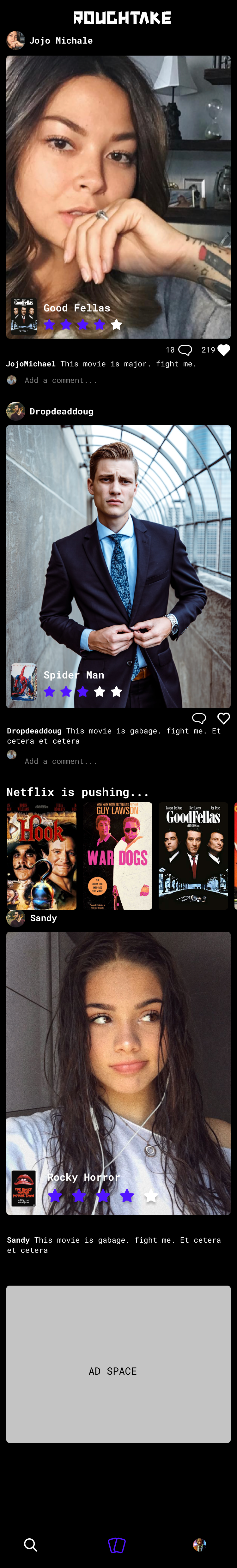
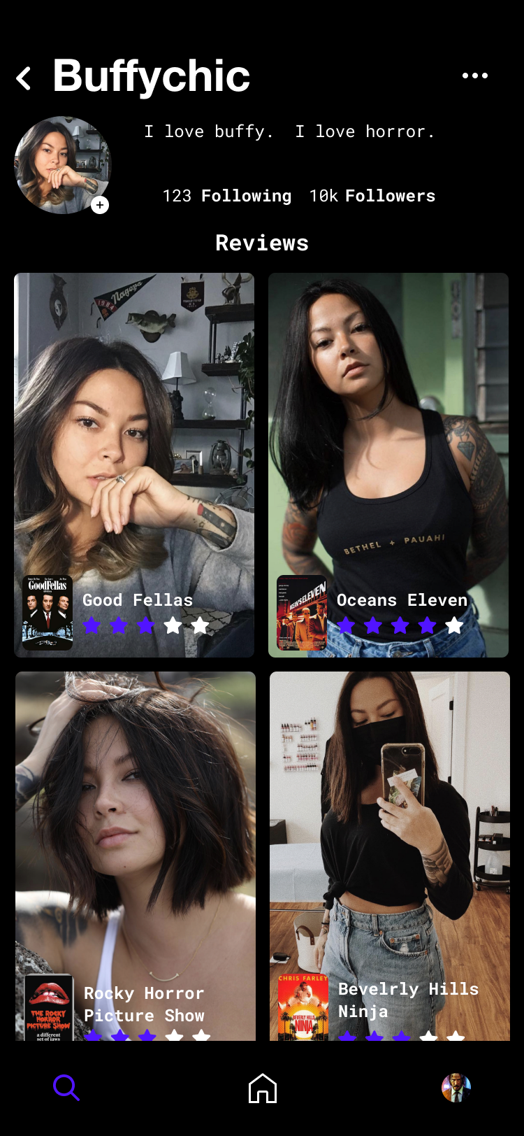
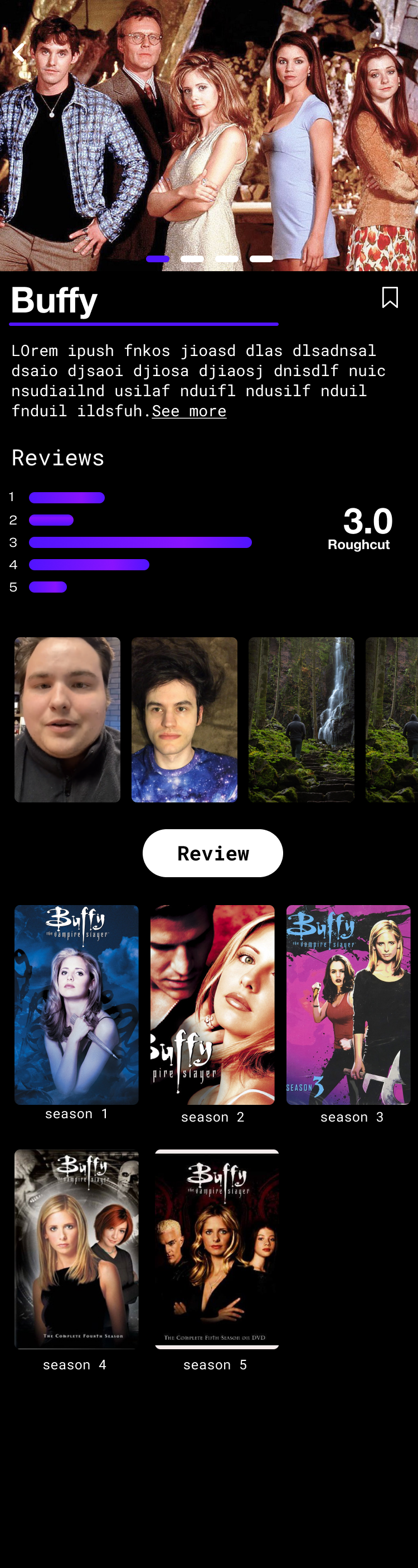
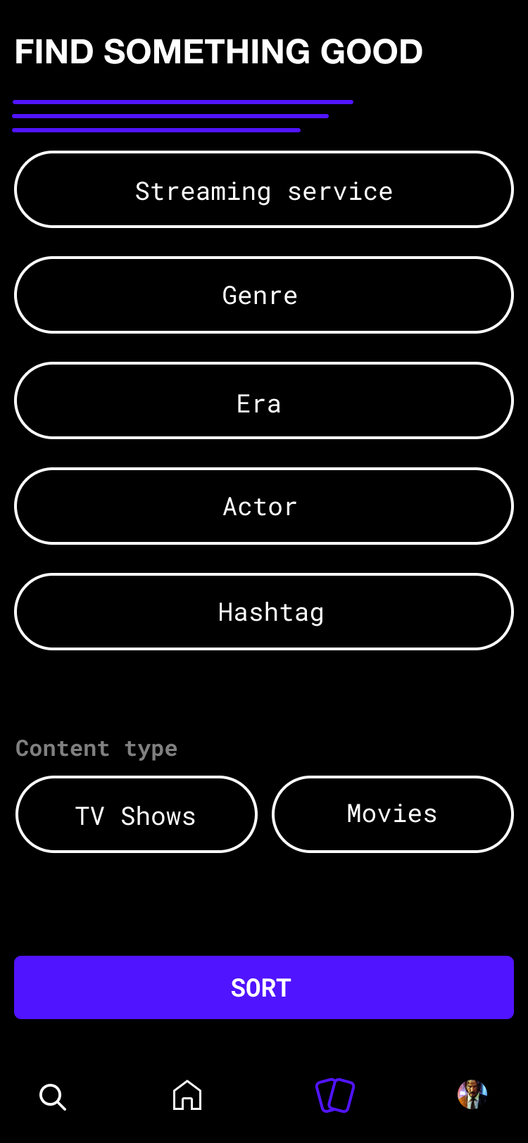
Roughtake is a consumer app at the intersection of social media and cinematic discovery. It combines the utility of IMDB with the dopamine loop of swiping — letting users find what to watch through a gamified filter experience, then share their opinions through short-form video reviews tied directly to the title.

This case study is different from most in my portfolio. This wasn't a client engagement with a defined scope and a retrospective. This is an ongoing project — one that's been through ideation, hi-fidelity design, partial development, a real stall, and a re-energized revival using AI-assisted coding tools. It's a messy, honest account of what it actually looks like to design something you believe in over time.

As the sole designer and founding decision-maker, every choice here carried real stakes — including the financial ones.

The market signal that started everything

Every product idea needs a moment. This one had a pandemic.

// The Cultural Moment
Streaming subscriptions in the US rose 38% in 2020 alone (Forbes). Content consumption was at an all-time high — but so was the paralysis of choice. The "what should we watch" conversation became a nightly ritual in every household, and everyone had developed strong opinions about what was worth their time.
// The Design Problem
Two friction points kept surfacing: discovery was either algorithmic and impersonal (Netflix's opaque recommendations) or informational and dry (IMDB's utility-first UI). And when people wanted to share what they thought about something they'd just watched, there was no native, modern space for it — opinions scattered across Letterboxd, Reddit, Twitter, and word of mouth.
38%
Subscription growth, US 2020
A once-in-a-generation spike in content ingestion created millions of newly opinionated viewers looking for context and community.
2
Core user problems
Find something to watch in a fun, informed way. Share your take in a quick, personal, modern way. Both problems, zero satisfying solutions.
0
Direct competitors at launch
No product combined gamified discovery with creator-style video reviewing tied natively to content metadata. The gap was real.
1
Insight that unlocked the concept
Dating apps had cracked engagement through swipe mechanics. The question became: how do you gamify the act of choosing something to watch?
Roughtake — UX overview

Where the gaps lived

Three existing players served parts of the need — none served the whole thing.

IMDB
Gap: Zero delight
The utility king. Unmatched data depth, but the discovery experience was a filter form. No social layer, no swiping, no personality. Designed for looking something up, not for finding your next obsession.
Letterboxd
Gap: Niche audience ceiling
Beloved by film obsessives — but its identity as a "serious cinephile" app created an invisible barrier for casual viewers. The UI skewed desktop-first and text-heavy. Reviews felt like essays, not takes.
DNGO
Gap: No review layer
Genre-first discovery with a clean mobile UI, but purely transactional. It helped you pick something, then had no answer for "I just watched it and have thoughts." Discovery and opinion were completely severed.

From bubbles to hi-fi in four iterations

Being the only designer meant the process was nonlinear, fast, and deeply personal. Every decision had to pull double duty — serving the user and convincing future collaborators.
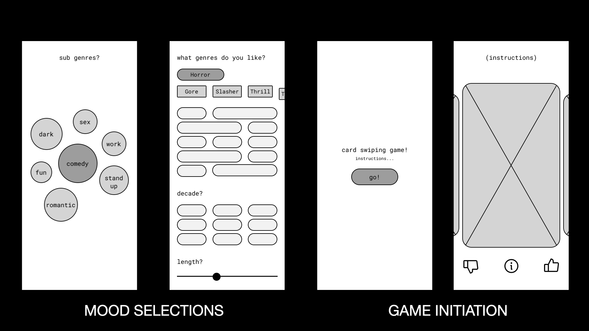
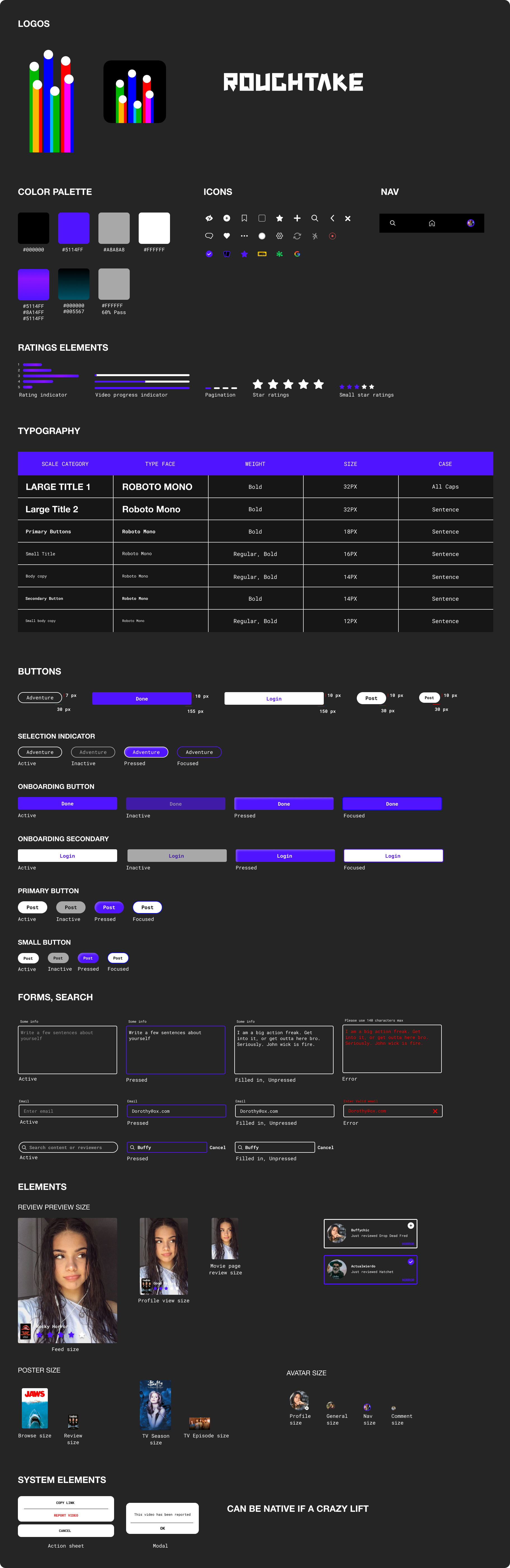
01
Mood Bubbles — "How Are You Feeling?"
The first wireframe asked a different question than every competitor. Instead of "what genre do you want?", it asked what emotional state the user was in. A bubble cluster UI let users tap into moods — dark, fun, romantic, stand-up, work — before any genre or title appeared. The insight: people choose content based on how they feel, not what genre they think they like.
02
Genre & Filter System
Once mood was established, users were dropped into a multi-filter screen: genre, decade, length, streaming service. Each filter was a pill — toggleable, stackable, low-cognitive-load. The decade filter was particularly resonant; "1990s horror" or "2000s comedies" activated a nostalgic specificity Netflix's algorithm never surfaced. Sub-genres expanded inline: Horror → Gore, Slasher, Thriller, Psychological.
03
The Card Swiping Game
The centerpiece mechanic: a full-bleed movie poster card with swipe right (interested), swipe left (skip), and a center info tap (details). The game metaphor was intentional — a "card swiping game!" CTA with instructions before entry framed the session as play, not research. Thumbs up / thumbs down / info on the bottom nav kept the interaction to three choices. No star ratings. No text input. Just gut reactions.
04
Hi-Fidelity "Pick a Vibe" + Social Profiles
The hi-fi prototype introduced the "Pick a Vibe" entry point — a cleaner list of filter categories (Streaming Service, Genre, Era, Actor, Country). This version also built out the social layer: reviewer profiles with follower counts, review feeds showing the viewer's face alongside the title poster, and a star rating visible in-feed. The goal was to make a film review feel like a creator's take — personal, visual, fast.
Roughtake — reviewer feed
Roughtake — reviewer profile
Roughtake — TV show detail page
Roughtake — app screen

Being your own PM has real consequences

When you're the designer and the stakeholder and the product manager, the quality of your own documentation directly affects the output — and the bill.

// The Dev Handoff Reality
Working with contract developers taught me something I couldn't learn in an agency: inconsistencies in your design handoff documents have a direct, tangible effect on your bank account. A missing state, an undocumented edge case, or an ambiguous component variant all translate into hours billed to figure out what you meant — or to rebuild something after the fact.

I had to write and manage updates and changes meticulously. Each ticket: the expected behavior, edge cases, the definition of done, and Figma component links with annotated states.
// API Integration Constraints
The film database API (TMDB) provided the backbone — title metadata, poster images, cast, genres, streaming availability by region. Designing around API constraints meant making product decisions early: streaming availability data had a 24-hour cache lag, which affected how I designed the "Where to Watch" layer. Real-time wasn't possible; the design had to accommodate stale data gracefully.

I had to learn enough about REST API responses to write accurate specs — not to code, but to design with realistic data shapes and latency in mind.
01
Spec Before Figma
Learned to write a one-pager on what a feature needed to do before designing what it looked like. Saved multiple rework cycles.
02
Component Annotation
Every interactive component in Figma got a comment thread covering: default, hover, loading, empty, and error states. Non-negotiable.
03
Phased Build
Split into three phases: core game loop first, social profiles second, review creation third. Shipped each in isolation to validate before adding complexity.
04
Live QA Protocol
Maintained a rolling QA doc — real device testing across iOS versions, edge case logging, and a "won't fix" tier to protect scope from creep.

The developer left me with a non-functioning app

// What Actually Happened

"He delivered source code locked to V1 — most likely to prevent me from taking the project elsewhere."

When the contract developer handed over the codebase, what I received wasn't a functional product — it was a deliberately limited V1 source drop. The app in the store didn't work. Navigation was broken, the home screen had no real functionality, and there was no admin panel — meaning I had no way to manage content or flag security issues from the back end.

I rebuilt the full navigation system, added real functionality to the home screen, and built an admin panel to handle content moderation and security. Then I re-released the app and worked through bugs across multiple rounds of testing. Since then, I've shipped three new versions to the App Store — each one a step closer to the product that was designed.

// What I Rebuilt
Full navigation architecture, home screen functionality, admin panel with content and security controls. Three re-releases to the App Store post-handoff — each one shipping fixes the original developer never delivered.
// What It Taught Me
Contracts need delivery criteria tied to working software, not code drop. Source code transfer clauses, functional acceptance testing, and staged milestone payments are now non-negotiable on any engagement I run — on either side of the table.

Picking it back up with vibe coding

Something shifted in the tooling landscape that changed the economics of building alone.

// What Changed
AI-assisted development tools fundamentally changed what a solo designer can ship without a full-time engineer. The bottleneck that stalled Roughtake wasn't the design or the idea; it was the cost and friction of translating well-documented specs into working code through a contract developer engagement.

With vibe coding, I can move from a Figma component to a functioning prototype in a fraction of the time — and more importantly, I can iterate in real time. The feedback loop between design intent and implementation shrinks from days to hours.
// What Stayed the Same
The UX foundation didn't change. The design system, the interaction models, the competitive positioning, the core loop — all of it held. The months of careful specification meant that when I brought the project back, I had clear, structured inputs: component specs, user flows, API schemas, edge case documentation.

Good documentation written for developers turned out to be perfect documentation for AI-assisted development. The rigour I built into the original handoff process was, accidentally, ideal preparation for this moment.
Roughtake — reviewer feed showing video reviews alongside film posters and ratings
// Design → Prototype Speed
Swipe game loop — 2 hours
The card swipe mechanic — swipe physics, gesture detection, UI transitions, API data binding — went from Figma spec to working prototype in a single session. What previously required a sprint estimate became an afternoon.
// Iteration Velocity
Design decisions close in real time
The gap between "I want to test this interaction change" and "I can test this interaction change" is now negligible. Edge cases that would previously go to a backlog ticket get tested immediately and either validated or discarded the same day.
// New Design Constraint
AI code needs clear UX thinking
Vibe coding surfaces a truth quickly: ambiguous design decisions don't get resolved by the AI — they get implemented as assumptions. Strong UX thinking upstream (clear flows, named states, explicit edge cases) is more important than ever, not less.
// What's Next
Closed beta + TMDB v3 integration
Active development is targeting a TestFlight closed beta with 40 hand-selected users — heavy streaming consumers across age ranges. The social review layer is scoped for v1.1, post core loop validation.

What this project taught me

4 Major Design Iterations
3 Competitor Gaps Identified
1 Patent Pending
Things a Solo Project Teaches You
// The Honest Takeaway
Roughtake is the most instructive project in my portfolio — not because it's the most polished, but because it's real. It shows how I think when there's no brief to constrain me, how I document when the audience is a contract developer who charges by the hour, how I handle the gap between vision and momentum, and how I adapt when the tooling landscape changes around a project mid-flight.

The UX principles that mattered here — designing for emotion over utility, gamifying friction, earning user trust through delight — are the same principles I bring to every engagement. The difference is that here, they came from conviction, not a client brief. That distinction shows up in the work.