Simplifying SCRUFF with information architecture change
IA redesign · card sorting · user testing · cross-platform

Identifying the Opportunities
The Problem. The most common SCRUFF complaint on the app store and in user interviews was persistent: "This app is too confusing." Metrics indicated that many deep features were never used — signaling a clear need for simplification.
The Goal. Evaluate and redesign the information architecture based on high-value flow prioritization. Streamline high-value interactions so that table-stakes functionalities are met by users with ease.
Research and activities
Buy-in is required by stakeholders. Our CEO is the primary engineer on these platforms — convincing him to embark on a major change initiative is a big undertaking.
// Feature Analysis
| Grindr | Bumble | Tinder | Chappy | Hinge | SCRUFF | |||
|---|---|---|---|---|---|---|---|---|
| In Primary Nav | ||||||||
| Messages | ✕ | ✕ | ✕ | ✕ | ✕ | ✕ | ✕ | ✕ |
| Profile | (on home) | ✕ | ✕ | ✕ | ✕ | (on home) | ✕ | |
| Grid (or match) | ✕ | ✕ | ✕ | ✕ | ✕ | ✕ | ✕ | |
| Favorites | ✕ | ✕ | ✕ | ✕ | ||||
| Event | ✕ | |||||||
| Venture | ✕ | |||||||
| Explore | ✕ | ✕ | ✕ | |||||
| Mode Change | ✕ | ✕ | ✕ | ✕ (×3) | ||||
| Menu | ✕ | ✕ | ||||||
| Search | ✕ | ✕ | ||||||
| Woofs | ✕ | |||||||
| Unlocks | ✕ | |||||||
| Another Match | ✕ | |||||||
| Post | ✕ (×2) | |||||||
| Feature Count | 4 | 3 | 3 | 4 | 4 | 5 | 8 | 14 |
This home screen nav analysis shows objectively that SCRUFF's 14 nav buttons on the home screen is not common or best practice. Cognitive load on the users is comparatively very high.
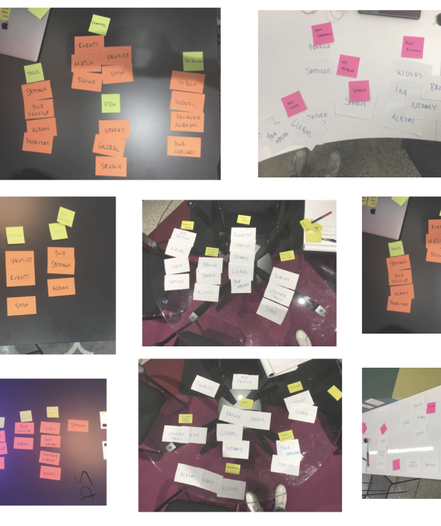
Card sorting to align the team
I conducted an open card sorting exercise to identify sentiment of the team around how high-value elements should be organized. This served to align everyone internally on next steps while gathering sorting insight.
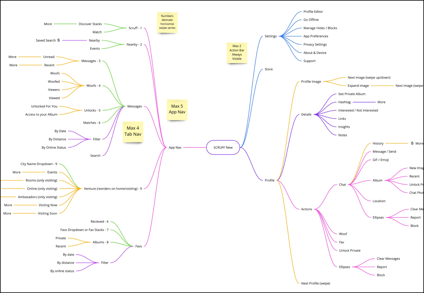
Visualizing the I.A.
Creating a flow visualization of the current state of SCRUFF helped organize all the high-level nav and sub-features while serving the purpose of aligning executive management with major changes. It's evident in the first image that most navigation features sit under the 'browse' tab.
// Simple Sitemap Visualization
Interaction mapping
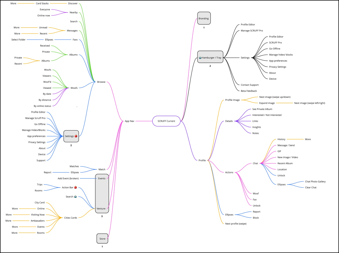
Interaction mapping for change
Moving into the design phase I used Miro to get a deeper sense of the navs. The sub-navigations and the types of interactions mapped out here helped inform how I could approach a new design system.
This helped answer questions about the types of interactions happening beneath the individual navigations.
A user test for a lofi prototype
A key factor that needed to be assessed was findability of the high-value flows for two primary user groups: legacy users and new users. Does this work for Android and iOS users?
I wrote a user test with essential baseline questions that needed to be answered in usertesting.com. I then collaborated with our researcher to ensure the test incorporated all best practices in question writing. Ex: Were the questions leading? Do we use the standard 5 pt scale?
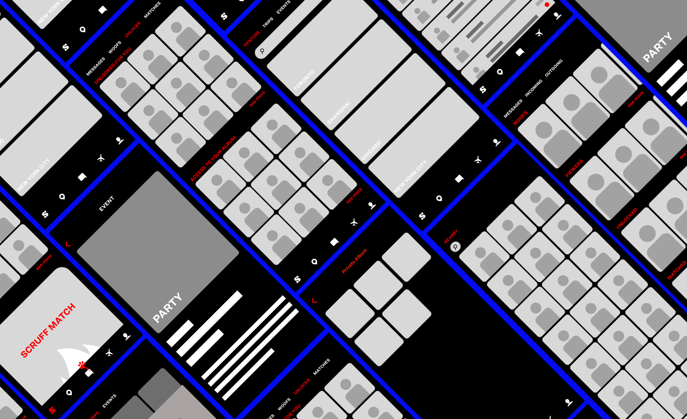
Using the newly established information architecture I created a low-fi design and prototype to test on users. I used existing visual language to ground the UI so the transition would be seamless and understandable for our legacy users on both Android and iOS.
The HiG and Material Design guidelines were referenced frequently.
Information Architecture Prototype →Selling the high def design
Once insights were gathered from the user tests, the pain points that most occurred for the navigation process were addressed for design. The successes stood as another selling point to executive leadership.
After some minor UI preference tests I redesigned the pain point areas and upped the fidelity for production.
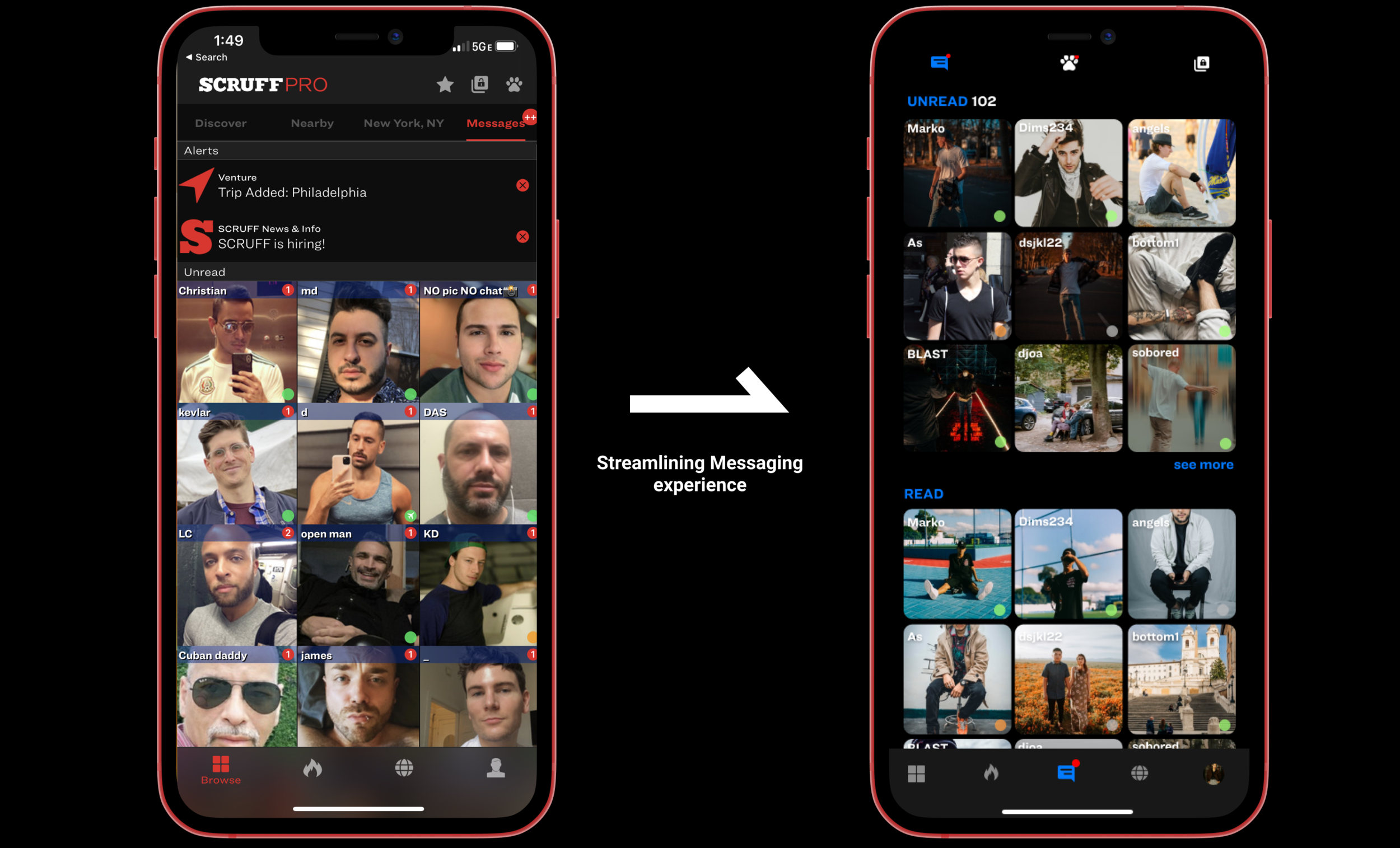
// Streamlining the Messaging Experience
Shipping development-ready design
Understanding how to deliver development-ready design is a big part of working at SCRUFF. I created tickets that incorporated design and wrote out the corresponding tickets using Gherkin Language.
Each design deliverable was paired with a Gherkin-formatted ticket that engineers could action directly — no ambiguity, no back-and-forth. This became standard practice across the design team and dramatically reduced revision cycles.
// An example